Tuesday, 12 February 2013


Here it is, in it's most basic graphic form. 45 degree baseline(s). Primitives. Helvetica Neue Bold.

Object Control!


Here's another I've done. I suppose it's a lot different from the last, what with all the editing, but I've still concentrated on the theme of magic. And there's still more potential. Perhaps a full set would be tasty? We'll see.

Monday, 11 February 2013

Levitation!


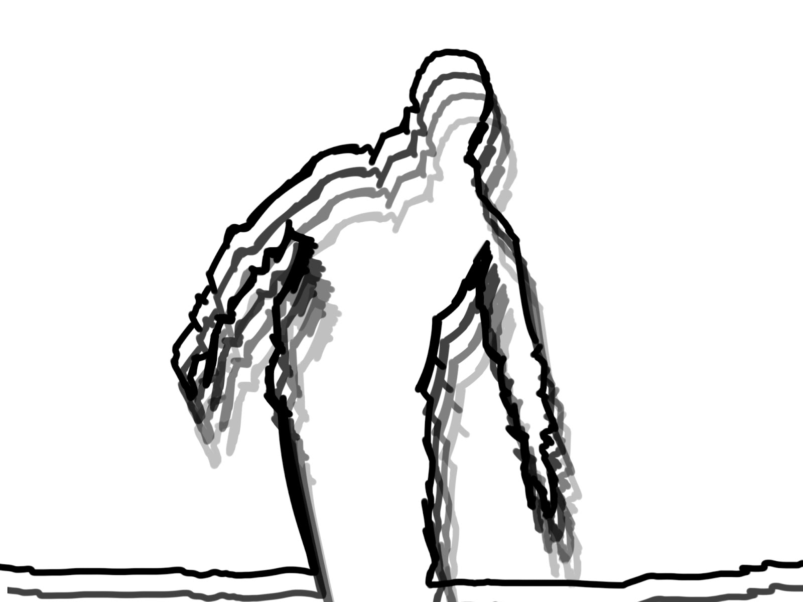
Mmm yeah, I can levitate. No, but I can use photoshop to the point where I can distort reality. I really like some of the things you can achieve with a tripod & camera, there is so much potential, and I already have some more ideas for how I can take this type of experimental photography further. It's also really important for me to make sure it's presented in a graphic format, so I've paired it up with what I feel is simple yet effective typography. 

Wednesday, 6 February 2013


Have a look at this! An info-graphic poster that shows a list of Typefaces, who designed them, and where. Absolutely genius, and beautifully displayed. Kudos to Shelby White!


Some typographic posters I had a bash at yesterday, the quote is by the American writer Brandon Mull. It's a good quote, for me it sums up that edge that is required to compete not just in the Art & Design world, but everywhere. I plan to get them printed each in A3, then have a little affair with a light box to try and reproduce them with a hand drawn finish. We'll see how it goes! 

Sunday, 3 February 2013

Thursday, 20 December 2012


These are just a couple of logos I've done in the past, for personal, college & competition work. I'm keen to display them all in the same format as I think it makes for a nicer portfolio finish.

Wednesday, 19 December 2012


Here are some film posters I've done for an exhibition at Keswick Film Festival, I wanted to create a continuos theme of simplified imagery, stripping something right down to it's elemental values.

Monday, 10 December 2012


This is the kind of thing I'm talking about, I think once edited properly & paired up with a slick typeface, these images have the potential to be cutting edge Graphic Design.

Wednesday, 5 December 2012

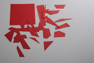
Red Shred!


Look at these little beauties! I call it "The Red Shred Project", it really is amazing what you can do with some cut up card and a big camera, I'm going to have a play about with them and edit the white balance etc. But then hopefully they'll be even neater, hoping to post some results up soon of some finished outcomes.

Friday, 23 November 2012


I really love these, even if I do say so myself... I wanted to get some graphic references in there. Tried my best to be witty, intelligible & creative. The typeface is gorgeous too! Hero Light? Yes please!

Wednesday, 14 November 2012


Get a bit of typography in there... Can anyone guess the lyric?

Saturday, 9 June 2012


I was going through some old photo's of mine a couple of days ago, when I found this delightful little silhouette I had taken of my friend against the setting sun and the shore. I decided I would use this to make an example of the many different ways you can treat an image, below the actual photograph are a just a few of those possibilities. There were many different reasons I had for giving an image a certain feel, whether it was to add a hand-drawn element to it, or to emphasise the natural contrast of the silhouette being created. Please enjoy looking at them as I have enjoyed working with them.