Thursday, 20 December 2012
Wednesday, 19 December 2012
Monday, 10 December 2012
Wednesday, 5 December 2012
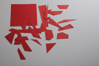
Red Shred!
Look at these little beauties! I call it "The Red Shred Project", it really is amazing what you can do with some cut up card and a big camera, I'm going to have a play about with them and edit the white balance etc. But then hopefully they'll be even neater, hoping to post some results up soon of some finished outcomes.
Friday, 23 November 2012
Saturday, 9 June 2012
I was going through some old photo's of mine a couple of days ago, when I found this delightful little silhouette I had taken of my friend against the setting sun and the shore. I decided I would use this to make an example of the many different ways you can treat an image, below the actual photograph are a just a few of those possibilities. There were many different reasons I had for giving an image a certain feel, whether it was to add a hand-drawn element to it, or to emphasise the natural contrast of the silhouette being created. Please enjoy looking at them as I have enjoyed working with them.
Wednesday, 4 January 2012
Cup Illustrations
I'M A CUP!
THESE ARE MY FRIENDS!
I LOVE FILMS!
BUT NOT BEING EATEN IN THEM!
AND DEFINITELY NOT BEING SQUISHED IN THEM!
I ALSO LOVE EXPLORING!
HANG 10 DUDE!
OH...HI!
OH I DO LOVE BEING A CUP.
I have created these illustrations to show the life experiences of a humble cup. I have achieved this style of drawing with a graphics tablet, an illustrating program, and a calligraphy pen tool. The use of layers is vitally important, because firstly I sketch out the shapes and outline I want in the image. Then, on another layer below the first, I simply block in the empty space with my desired colour. To add the this effect and to also add an element of 3D, I darken the shade of colour and apply to certain areas. I have thoroughly enjoyed both designing these images, and illustrating.
Subscribe to:
Comments (Atom)


