I took the design I made earlier with the gradients and applied different colour schemes, the idea is to underline the way we associate certain colours with certain things; like football teams. This was heavily inspired from the previous posts regarding Vasava's custom made Typeface for FC Barcelona.

I love all things Graphic, Typographic, Pictographic, Illustragraphic, Aestheticallypleasingographic...
Saturday, 30 March 2013
Adding gradients to Type...


This is a good example of the subtle but effective differences a gradient can make, it just adds an extra level of definition and in these particular pieces, they add a sense of depth too.
Tuesday, 12 March 2013
FC Barcelona Typeface

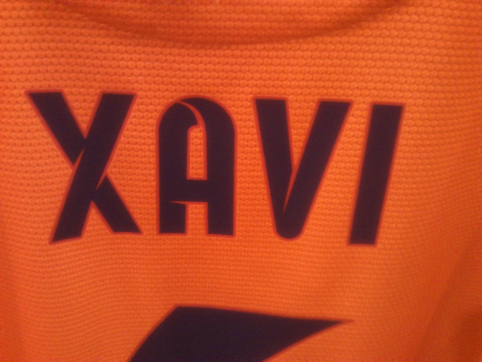
This is the custom made Typeface for FC Barcelona's football shirts, these were photographed at the Nou Camp itself whilst touring the stadium experience. And I was also lucky enough to visit the design studio were this was made, Vasava. I'm thinking of replicating this kind of football Typographic style that is so widely recognised in my own way.
http://www.vasava.es/
Friday, 8 March 2013
What is this sign?

As a designer, you design. That much is clear. But this sign I snapped in Barcelona is so strange. I don't understand what the design is saying. Is it merely informing you that people are probably playing with a ball on a housed road with cars parked there? Icons are globally universal, they rely on pictures to communicate a message rather than Type so that everyone can understand. But I don't. Is it just me?
Gaudi House. Well, actually...just the sign for it...


Yes a couple of us visited the Gaudi houses while we were in Barcelona. Here's the shocking part: I can't fu**ing stand any of it. Pardon my Catalan. I really don't understand his work, particularly those houses. To me it just looks as though he's just thrown pieces of marble and coloured rock at grotesquely shaped curved buildings. Maybe I don't like it because I'm so anally retentive about straight lines and equal borders and angular baselines etc. Anyway, rant aside... I did notice that perhaps the only good thing about it was the sign outside. Whoever was in charge of designing this was clearly well informed about Swiss Graphic Design, there's grid systems in there, nice slick San Serif Type in there, and sharp angled geometry and baselines. It's really great. So all in all, it was worthwhile going.
Thursday, 7 March 2013
More Barcelona

Again this photo was taken in Barcelona, and it's the logo of a lovely little sandwich shop we stumbled into. I don't really understand the whole "hand as a fork" thing, but I know it's cool. The Typeface compliments the icon well. Plus the sandwich was excellent!
I was going to post a link of the website for the shop, but unfortunately I can't find it. So you'll have to make do...
Wednesday, 6 March 2013
More Barcelona


This is a poster I snapped a quick pic of, it got my attention with it's successful use of Typeface pairing. The one below I believe is either Bebas or Bebas Neue (or something similar) and I'm not sure about the one above but they work really well together! I also like the use of the "not quite" 100% opacity.
Tuesday, 5 March 2013
First of Barcelona informed research photos!


This is a chain of bank that I noticed whilst in Barcelona. The whole professional and corporate feel of it really impressed me; there were a lot of different reasons I noticed it to such detail: The colour scheme; I often feel orange can be a bit of a wild card when it comes to branding, I personally love the colour orange in design work and I think that if done well it can be gorgeous (Penguin, Orange etc.), but if the wrong tone is used it can be hideous. This is perfect. The Typeface; the angled edges really add a certain definition to it, and again it adds to the overall feel of the firm. The mixture of light and regular weighted Typeface, it just works. A nice brand, and certainly more attractive than any banks we have in Britain!
Monday, 4 March 2013
Abstract Typeface Design


So this is the first instalment of my Final Major Project, and the brief I have set myself is basically to design Typefaces. Plain and simple. Although it will be accompanied by extensive research into the field of Typography, for example: Font pairing, what looks good together what doesn't. Kerning, serifs, Type Designers like Adrian Frutiger, Tobias Frere-Jones and Carol Twombly.
So again, this set above is a Typeface I've designed with the intention of emphasising simplicity, geometry and primitives. Now, it's not supposed to be entirely legible, that much is clear (Through experience almost none of my classmates could read or understand the characters G & Q {There's a thought, perhaps I could apply the GQ magazine logo in it to try and give it a new feel}).
Eventually it's my intention to have at least a couple of Typefaces, and I don't expect them to be similar, in fact they're all being made with different intentions so they'll definitely be different.
Subscribe to:
Posts (Atom)