Showing posts with label typography. Show all posts

Thursday, 12 September 2013

A-Z of Typefaces


Here's a response to a summer brief set for me with starting my degree at Leeds College of Art on the 23rd of this month. It proposed that I deliver 26 10cm x 10cm 2D pieces each displaying a letter of the alphabet, with the motive of expressing a bit about myself. Well, this range of work says that I like Typefaces; each piece has a key of up to 5 stars to represent my personal opinion of it, however I'm starting to think that was a pointless decision, because I doubt I'd ever knowingly use what I felt was a poor Typeface. Imagine Comic Sans for example, okay it sets the bar for a 1 star Typeface in my view, so it would be great in representing my opinion, but I still wouldn't feel comfortable with it among the other Typefaces.

Anyway here's a taste of some of the ones I've designed so far, there will be more to come.

Thursday, 23 May 2013

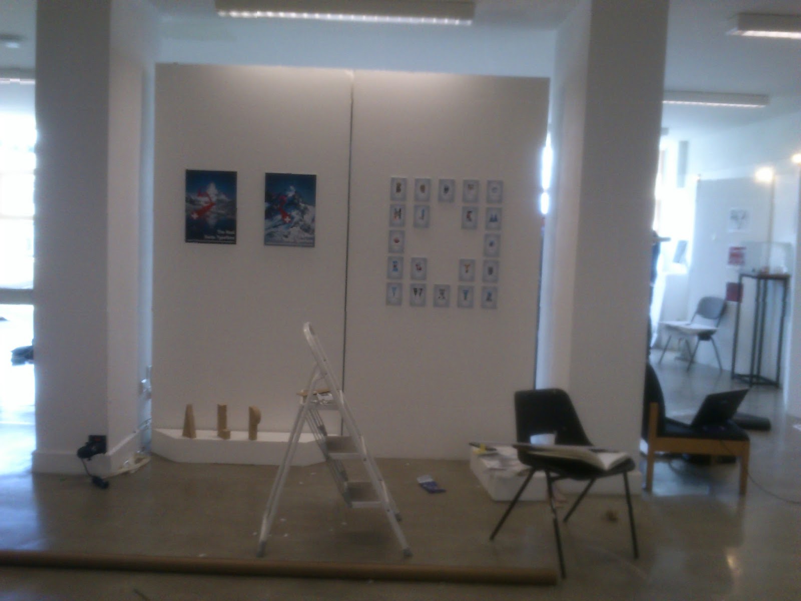
Exhibition Mounting!


Phew! It's been one of those days, mounting and preparing exhibition spaces isn't one of my strong points, but it's worthwhile in the end. These two boards will be the blank canvas where my Final Major Project will unfold; I've decided to focus on the Swiss Typeface I created, as I feel this was the most successful body of work. The reason I think that, is probably because I like the theme behind it so much, the whole turning traditional Swiss Typography on it's head and applying a literal and ironic feel to it has been interesting, and I still think there's potential for it (or alternative routes I could have taken whilst still fulfilling my goal).

But here it is. I can honestly say I'm pleased with it, it's not mind blowing I'll admit, and it's not the strongest body of work I've done either, but I can genuinely say I believe I've achieved the goals I set out to accomplish.

Tuesday, 7 May 2013

Digital Swiss Collage


And here is the final one. I think it'll be nice once printed out full size with supporting media. I'm really pleased with it actually, it's been a lot of work, but rewarding at the same time. It's been nice to finally get some real Graphic Design work done. What I mean by that is, I've enjoyed doing my final major project very much, designing Typefaces has been an interesting learning curve and I'll probably visit the techniques I've learned again in the future. And while I've enjoyed it, I still enjoy putting the supporting design work towards it better. I think it's improved my view of Typefaces, I understand them differently now.

Swiss Typeface Supporting Poster (Part 1)


I posted last week about the Swiss Typeface I made for my project, well I stated early on that it was always my intention to design some supporting promotional material to show it off. Well, here's a poster I've done today. It's an A3 of lots of different media cleverly mixed through different layers and masks etc. It's been a lot of work, and I've really enjoyed making it. I'll post different sections of the body of work under new posts just to explain more about the images, just to keep it more organised.

So these first four images show the incremental/sectioned elements that make up the overall piece. I started of with a graphic that was built up using lots of different circles and altered rectangles (my intentions were for it to represent the square cross of Switzerland). The third image down you may notice is made of chocolate, this was an effect which I knew quite well and was keen to use for this particular piece. The other two images depict photographs and images that I used in the digital collage, all edited beyond belief... And of course the Typeface itself. The overall feel of the graphics mirror the style of the Typeface; sharp edged, primitive and graphic.

Friday, 26 April 2013

Type Point of View


Have you ever wondered what happens on the other side of a computer screen? Yeah, well it's probably not this... But it makes for a nice idea, so I tried illustrating it! I Used my wacom tablet and did some drawings in Sketchbook, it's turned out all right, however I think the colours seem a bit washed out, so I've posted the non-colour version too. The Typefaces I've personified are: Helvetica, Futura & Akzidenz Grotesk.

Wednesday, 17 April 2013

GQ Cover Mock-Up

Starting with the original.


In an earlier post I mentioned how the first Typeface I created was more abstract in certain characters than others, in particular the G & Q. Which got me thinking...coincidence? Or fate? Haha, no but really I tried applying the GQ logo with my own Font, then I changed aspects about it. Eventually I started to actually change the Typeface itself, changing the positions of the cross bars and finally cutting sections out to improve legibility. Essentially it is still the same Typeface I started with, it still reflects the key principles I set out with on creating it: Simplicity & Geometry. It's interesting how my final result has something of the original in it, perhaps it's the natural curvature of it.

Tuesday, 16 April 2013

Personal Branding


I've had a jab a personal branding today, it's turned out alright I guess. But, there's only so much you can do with Photoshop, so I think I'll try and get that stamp laser cut. Then I can do it for real, and I think I could look quite good, for business cards and other promotion material.

The Typefaces I've used are Caviar Dreams for my initials and Futura for the other, I think they work really well together and I'll remember this pairing for future projects.