Showing posts with label matterhorn. Show all posts

Thursday, 23 May 2013

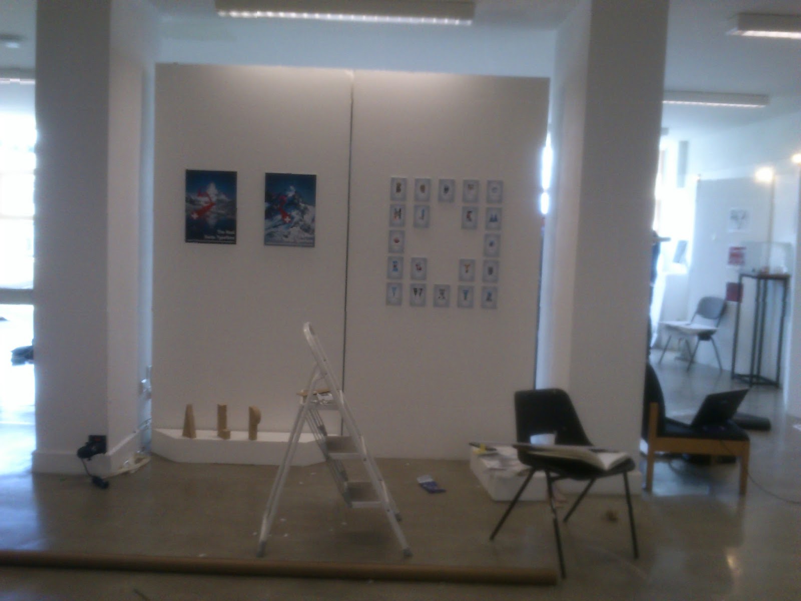
Exhibition Mounting!


Phew! It's been one of those days, mounting and preparing exhibition spaces isn't one of my strong points, but it's worthwhile in the end. These two boards will be the blank canvas where my Final Major Project will unfold; I've decided to focus on the Swiss Typeface I created, as I feel this was the most successful body of work. The reason I think that, is probably because I like the theme behind it so much, the whole turning traditional Swiss Typography on it's head and applying a literal and ironic feel to it has been interesting, and I still think there's potential for it (or alternative routes I could have taken whilst still fulfilling my goal).

But here it is. I can honestly say I'm pleased with it, it's not mind blowing I'll admit, and it's not the strongest body of work I've done either, but I can genuinely say I believe I've achieved the goals I set out to accomplish.

Tuesday, 14 May 2013

Matterhorn Poster


Here's a new poster I've made today to showcase my Swiss Typeface for my FMP, it's a mixture of photo-editing, photo-illustration and Typography. Again I've stuck with Avenir as to strike a direct contrast between the Ironic Swiss Typeface I've created and the traditional sans serif style.

Whilst making it I found my self sitting looking at it and wondering what was missing, it finally clicked that I needed a reflection in the water, I feel it adds an extra level of realism. My plan is to pair this with the other A3+ poster (below) I made for this series of work and display them both in exhibition.

Tuesday, 7 May 2013

Digital Swiss Collage


And here is the final one. I think it'll be nice once printed out full size with supporting media. I'm really pleased with it actually, it's been a lot of work, but rewarding at the same time. It's been nice to finally get some real Graphic Design work done. What I mean by that is, I've enjoyed doing my final major project very much, designing Typefaces has been an interesting learning curve and I'll probably visit the techniques I've learned again in the future. And while I've enjoyed it, I still enjoy putting the supporting design work towards it better. I think it's improved my view of Typefaces, I understand them differently now.

Wednesday, 1 May 2013

Swiss Typeface


I've mentioned that as part of my final major project I'm creating Typefaces. Well this here is one created with the intention of it being Swiss through and throughout. But not by traditional standards, when we think of Swiss Style Typefaces, we think of the classics like Helvetica, Avenir, Frutiger and so on; but this here is embodying a different sense of Swiss. I decided to pair each character with a matching photograph that represented Switzerland in it's own way, a lot of them being mountainous Alpine scenery. That's what actually gave me the idea in the first place. The first two characters I created were A & M, if you look again you'll notice the M is just a doubled-up version; both of these characters already have a mountainous quality to them, so I had the idea to add a photograph over the top to emphasise the shape of the character.

Overall I think it's worked it okay, I like the whole concept and idea, it gives it a whole ironic and literal context. To be honest though, it was difficult to find pictures suitable for some of the less obvious ones. For example, a lot are simply places in Switzerland e.g. Zurich, Geneva etc. The Typeface I used for "The Real Swiss Typeface" is Avenir, not just because I like it, but because it's neutral enough to add the exact juxtaposition I was looking for; literal vs actual Swiss Style Typeface.